


I’m trying to finalize a business card design to then take to print & thought I’d post my top 3 favorites here for anyone’s contributing input. Which design do you like the best? Which design looks the most professional? Should there be more food photography on the card? Thanks for your perspective!


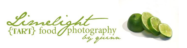
I like the second one. It is the least busy. I like the limes, but I think they are a little too much for a small business card.
All three are very good designs. I’ve been in business for 30 years & what I tell my small business clients is that it can be helpful to ask around and get some opinions but in the final analysis, it is YOUR business.
So if you really prefer one of the designs over another then that is the one you should choose.
My personal opinion, I also prefer the 2nd design.
I would suggest you consider using a backside print of the card to showcase some of your actual photography. If you use an accomplished business card printer (like us) most do not charge any extra cost to print the backside of the card.
I second that. I love the second one–crisp and clean yet with a little design and flair. So cute! When did the new {TART} thing come in to play? Did I miss that before? So cute!
me too number 2
i think without the image because its in a white boxs breaks the natural flow of the design
prehaps try cutting out the limes and adding them minus the white square might work ?
but great designs i wouldnt expect anything else from miss quinn
I like #2 a lot too — but if you are really looking to promote your food photography business I’d strongly recommend you use the #3 one instead, which I also like. Why? Because he design emphasis and decorativeness of the #2 one actually take away from the food photography emphasis of the #3 one, whichBTW is very clean and highlights your food photography and your company name in an appropriate way, which is you want to do. Are you using the lime image as part of your logo??? You might do that — it reinforces the name of your business in a very strong way. Builds your brand. -M